NeuUX AI
Designing an AI-powered UX system that transforms raw ideas into structured product thinking — reducing friction in early-stage design workflows.
Context
In early-stage product development, teams struggle to convert raw ideas into structured UX outputs like personas, journeys, and strategy documents. This creates delays, misalignment, and repeated iterations.
Problem
UX workflows are fragmented and manual. Designers spend significant time translating ideas into structured artifacts, slowing down decision-making and reducing focus on actual problem-solving.
Opportunity
If AI could assist in structuring thinking — not just generating content — it could reduce repetitive work and enable designers to focus on higher-level decisions.
Approach
I designed NeuUX AI as a system, not a feature. The focus was on creating a guided, conversational flow that translates a simple project brief into structured UX outputs.
.png)
Solution
NeuUX AI acts as a UX intelligence assistant that supports the entire early design phase:
- AI-generated project overview and problem framing
- Persona generation with editable attributes
- Journey map creation based on selected personas
- Conversational refinement of UX outputs
- Structured storage for scalable workflows
The system is designed to support thinking, not replace it — keeping the designer in control.
.png)
Key Decisions
- Shifted from “AI generates UI” → “AI structures UX thinking”
- Designed modular outputs instead of one-time results
- Used conversational UI to reduce friction in iteration
- Ensured outputs are editable, not fixed
Trade-offs
- Reduced feature complexity to maintain clarity
- Avoided full automation to preserve designer control
- Focused on early-stage UX instead of full product lifecycle
Impact
NeuUX AI reduces the time required to move from idea to structured UX outputs, helping designers and teams align faster and focus on decision-making instead of documentation.
By transforming UX into a system-driven process, it creates a scalable approach to early-stage product design.
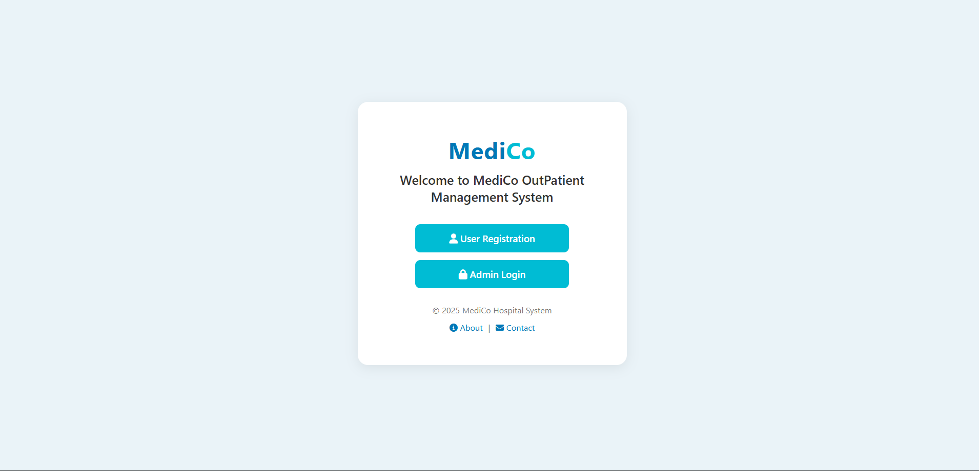
MEDICO
Designing a structured outpatient system to replace chaotic hospital queues with a scalable, real-world workflow.
Context
In many hospitals, outpatient (OP) processes rely on manual registration and unstructured queues. Patients wait without clarity, and staff manage flow through fragmented, error-prone systems.
Problem
The lack of a structured system creates confusion for patients and operational inefficiency for staff. There is no clear flow, no visibility, and no scalable way to manage patient load.
Opportunity
A digital system could introduce structure into the OP process — improving clarity for patients while giving hospitals better control over workflow and scalability.
Approach
I mapped the complete patient journey — from entry to consultation — identifying key friction points in registration, token handling, and department flow.
The focus was not just on UI, but on designing a system that works within real hospital constraints.
Solution
MEDICO is a structured OP management system designed to simplify both patient and admin workflows:
- Digital patient registration with auto-generated IDs
- Department-based token system for organized flow
- Integrated payment step for applicable patients
- Admin dashboard for hospital-level control
System Design
The system is designed as a multi-layer workflow:
- Patient Layer → Registration, token generation, visibility
- Admin Layer → Hospital-specific data and control
- Flow Layer → Department-wise queue management
- Output Layer → Virtual token via whatsapp message
This ensures the system works both digitally and physically within hospital environments.
Key Decisions
- Designed for low-tech environments with minimal learning curve
- Prioritized clarity and speed over feature overload
- Separated flows by department to reduce congestion
Trade-offs
- Limited UI complexity to ensure ease of use for non-technical users
- Avoided advanced automation to maintain system reliability
- Focused on OP workflow instead of full hospital system integration
Impact
MEDICO transforms an unstructured waiting system into a predictable, manageable workflow. Patients gain visibility and clarity, while hospitals gain control and scalability.
The system reduces confusion, improves operational efficiency, and creates a foundation for scalable hospital management.
Beyond Syllabus
Designing an adaptive learning system that moves students beyond rigid academic structures into real-world, skill-driven learning.
Context
Traditional education systems are structured around static curricula, often disconnected from real-world skills and evolving industry needs.
Problem
Students lack access to flexible, personalized learning paths. Existing platforms focus on content delivery rather than helping users navigate what to learn and why.
Opportunity
By introducing AI-guided learning flows, it’s possible to shift from static content consumption to dynamic, intent-driven learning experiences.
Approach
Focused on designing a system that adapts to user intent — allowing students to explore topics, get guided direction, and access relevant learning resources without rigid pathways.
The goal was to reduce confusion in “what to learn next” and make learning more actionable.
.png)
Solution
Beyond Syllabus is an AI-assisted learning platform that provides:
- Intent-based learning guidance
- Subject-specific and general exploration paths
- Dynamic content suggestions based on user needs
- Clear navigation across learning domains
Instead of fixed courses, the system supports flexible, user-driven learning journeys.
System Design
The platform is structured as a layered learning system:
- User Intent Layer → Captures what the student wants to learn
- AI Guidance Layer → Suggests direction and pathways
- Content Layer → Provides relevant learning resources
- Navigation Layer → Enables exploration across topics
This allows learning to adapt dynamically instead of being pre-defined.
Key Decisions
- Shifted from content-first → intent-first design
- Designed for exploration instead of linear progression
- Reduced cognitive overload through structured guidance
- Focused on clarity and accessibility for students
Trade-offs
- Avoided deep personalization complexity to maintain usability
- Limited content density to prevent overwhelming users
- Focused on guidance rather than full learning ecosystem integration
Impact
Beyond Syllabus enables students to navigate learning more independently, reducing confusion around what to learn next and improving engagement with meaningful content.
The system shifts learning from passive consumption to active exploration — making it more aligned with real-world skill development.
Purple Movement
Designing a community platform that translates purpose into participation through clear, structured digital experiences.
Context
Purpose-driven communities often struggle to communicate their vision clearly in digital spaces, making it difficult for users to understand how to engage or contribute.
Problem
The platform lacked a clear structure for presenting initiatives, resulting in low engagement and limited user participation despite strong intent.
Opportunity
By structuring content and simplifying user pathways, the platform could move from passive information display to active community engagement.
Approach
I approached the platform as a system of communication and participation — focusing on how users discover initiatives, understand purpose, and take action.
The goal was to reduce ambiguity and create a clear path from awareness to involvement.
.png)
Solution
Designed a structured digital platform that:
- Clearly presents initiatives and their purpose
- Organizes content for easy scanning and understanding
- Guides users toward participation pathways
- Maintains a consistent visual identity aligned with the community
Experience Design
The experience is built around three key stages:
- Discover → Users understand the vision and initiatives
- Connect → Users relate to the purpose and explore deeper
- Participate → Users take action and engage with the community
This structure ensures clarity while encouraging meaningful interaction.
Key Decisions
- Prioritized clarity over visual complexity
- Structured content to reduce cognitive load
- Designed for storytelling and emotional connection
- Focused on guiding user action, not just presenting information
Trade-offs
- Reduced visual experimentation to maintain clarity
- Limited content density to avoid overwhelming users
- Focused on core engagement flows rather than feature expansion
Impact
The redesigned platform improved clarity and accessibility, helping users better understand the community’s purpose and engage with its initiatives.
By structuring the experience around participation, the platform shifts from passive browsing to active involvement.